MAGAZINE1

The masthead is in sans serif font which is simple and readable, perfect for the magazine's young audience. The 'W' is in a different font to the rest of it, this makes it look different and also links in with the speech bubble it's in.
This is the banner along the top of the magazine. It appeals to its target audience because it makes the front cover very cluttered so they have plenty to look at.
 This is the main image on the magazine which is appealing to children/ teens because the celebrities are well known to that age range. The quotes make the reader want to buy the magazine and see what its all about. The shot type is a mid shot which leaves plenty of room to pile writing on top.
"Hot! Hot! HOT!" adds another font to the front cover adding to the cluttered look that appeals to its younger audience. These are also buzz words used to appeal to younger audiences.
 "The X Factor" is a recognised logo which will make the target audience want to pick up and buy the magazine to find out what is going on so that they can be up to date with their friends.
 This magazine also has a fashion section which will appeal to the younger female audience. This also has a lot of pictures and different fonts adding to the cluttered look of the front cover.
This is the pug. it shows the price, date, issue number and website.

This is a banner along the bottom which shows more of whats inside and makes sure every inch of the front cover is filled.

This shows some of the posters that the reader will get inside the magazine. As it is aimed at a young female audience they love to plaster their bedroom walls in posters of their favourite celebrities and this will encourage the reader to buy the magazine because they're popular celebrities among the younger audience.

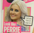
Perrie Edwards of Little Mix is a popular role model of the younger female audience. Seeing that they can "Look like PERRIE" will encourage them to buy the magazine to reveal the secrets on how to look as perfect as a well known celebrity.
Harry Styles will appeal to most of the young female audience so by having him on the front they are likely to sell a lot of copies and maybe pick up some new readers. The quote will make the audience want to read inside because it's an unanswered question which will become clear if they buy the magazine.


A bit more analysis needed here - you need to really think about different sections eg banners/ pugs/ puffs and how this has inspired you. Also include representations and look at iconography. You are identifying codes and conventions which is Level 2 but not really exploring the range of meanings created by the signifiers. Also, you need to think about how/ why an institution would take on your magazine when so many exist that are targeted at young girls.
ReplyDelete