Friday 28 February 2014

Evaluation Q1


This is my front cover. After my research into existing magazines, I knew my page must be cluttered to be recognised as a pop magazine. To stick to this convention, I organised as many photo shoots as possible so that I was able to get lots of different photos to use on my magazine. When taking my photos, I kept in mind that for a pop genre, I had to have the model wearing bright makeup and clothes, and looking into the camera lens looking smily, happy and innocent as someone for my young audience to look up to. By shooting the photo so that the model was right of frame with a white background, I allowed myself plenty of room to fit in a lot of pictures. My original intentions were to place three photos and pull quotes down the side of the model, however after beginning my construction I found that I didn't have as much space as I had hoped. This means everything on the page is tightly squashed together with not too much blank space, which follows the conventions of a pop front cover.
I also broke the conventions of a music magazine by including a lifestyle section. My reason for this was that almost every single one of the existing successful magazines aimed at this age range include a fashion section within the magazine somewhere. Although it does go against conventions, I feel that by adding in this section makes it more obvious of the genre of the magazine and who it is aimed at. It also gave me opportunity to add in more shapes, puffs and different fonts which is used on magazines aimed at the younger generation to provide variety.
The red colour used on the artists name was also used throughout as a house style which follows the usual conventions of pop magazines. I also used the same pink/red colour on some boxes and fonts to tie the page together and give it a colour scheme. The red I used was chosen from the model's dress to make her involved in the rest of the page.

On my contents page, I followed conventions by using pink colours to appeal to a younger female audience. The fonts were chosen carefully with the intention to make it look young and girly. I placed the santa hat in the corner of the page to fill blank spaces and link back to my festive December issue. I concentrated not to let the festive theme take over as this would break conventions of a music magazine.                       
                                                            
I followed the convention of the three columns, and large numbers. I also used a technique in not only pop magazines, but many contents pages of various different magazines, to add a small caption after each topic to give a bit of information as to what will be on the pages. The banner at the bottom was originally intended to be a poster banner however I didn't manage to collect enough photos to fill the banner so I put in social networking details instead which I think works better. The language used follows the conventional colloqialism of pop magazines which makes it easy reading for the young audience.

I broke the conventions of a contents page as it doesn't follow an obvious colour scheme. I intented to use red and green to fit the ongoing Christmas theme, however it doesn't look as classy as I had hoped. I think this is because of the large yellow square and the pink background. We filled in the background a light pink to try and appeal to our young audience and make the blank spaces appear filled in, but if anything I think it has just made the page look overall messy and unfinished.


A lot of research into existing magazines was done for the double page spread. The language used and the way it was displayed was decided by slightly manipulating the typical conventions of the pop DPS's. The interviewing question-answer style was done in almost every existing magazine I looked at. The question was done in a different coloured font to the answers in order to separate them and the reader is able to quickly read what they want to without it getting boring. As with the contents page, I used colloqial language which in this case encourages the reader to hear the interviewee's voice whilst reading.
I originally intended to have all pull quotes in a circle. However after many drafts, I decided to use lips which I feel work well with the genre and age group. Following conventions, I put in the cloud at the top which makes it easily accessible for the reader to find the interview with the cover star.
I broke conventions of a double page spread by using the yellow colour as a drop capital, the rest of the page is red, black and green so the yellow stands out, and I don't think this works well.


Thursday 27 February 2014

Evaluation Q2

I used colloquial language on my magazine pages to represent young modern teenagers. By using direct address, "girlies" I have also made the reader feel involved which is conventional of a pop genre. "+ juicy goss!" is something you may hear my target audience saying everyday, so this appeals to them as it is like talking to a friend which is what my target audience are looking for in a magazine. I used young pop terminology such as "jam-packed" and "celeb gossip".


I used this pink colour on my
contents page as this represents
females, and Pop World is
                                                         heavily female orientated so
 hopefully by using pink, we are able to attract and represent our target audience of 12-16 year old girls.


This is the lipstick my model was wearing on the front cover shoot. By wearing bright pink lipstick, she is representing the pop culture and it's audiences. The pink lips and red dress also ties in with the pink and red house style running throughout the magazine.

I also used lips for a pull quote on my DPS. This is typically very girly and young, which represents my audience. It also ties in with my models bright lips on the front cover.


By using buzz words such as "WIN" and "EXCLUSIVE", I can immediately draw in my audience. This type of language represents young people as excitable, and the pop culture as the stereotypical fun and bouncy.


Evaluation Q3


Monday 24 February 2014

Evaluation Q4

http://prezi.com/lgmtbwehz2fm/who-would-be-the-audience-for-pop-world/

Evaluation Q5

I used informal, chatty language to make my audience feel involved and make it easy reading. My original intentions were to use formal language on my contents page, however after looking at existing magazines I decided to use language which fits the conventions of a pop magazine.
On my front cover, I used buzz words such as "exclusive" and "win" to draw in my audience.
The way I posed my model was also done to attract my audience. I made sure she was wearing bright lipstick and makeup which would typically be worn on pop-stars which would give my young readers a role model to look up to.

The front cover is colourful and jam-packed with pictures, shapes and different fonts to make it really eye-catching for my young audience. The colour scheme is centred around different shades of pink as pink is stereotypically associated with 12-16 year old girls. Looking back, the green box doesn't look right with the rest of the page so if I did it again I could probably make the box the same as the "exclusive" box so that it creates a red/white house style which also fits with the festive December issue. On reflection, this could also help the sales of the magazine to the industry as they can see how seasonal editions could become very popular; the magazine could also have special editions in the future.

In addition, we chose a model with braces. This was intentional as many young girls feel negative about their appearance and we hoped this would show how you can still be a pop star with braces. In fact, we hoped to connote that care for your health eg teeth, weight etc is important. On reflection, I would like to have pursued this further and had a feature that linked to gossip/ lifestyle that reinforced the idea that you don't have to be as stunning or as thin as Miley Cyrus. Our TA said they did like this image and I thought that was very positive.

Our house style and choices don't target boys in any way. This was a definite decision and I still think it was the right one. Boys have very different interests to girls especially in this age group. I wouldn't change this at all. 

Friday 14 February 2014

Evaluation Q6

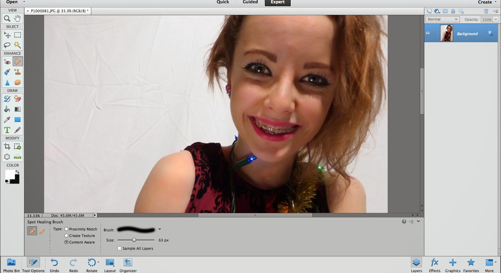
When I first began using Adobe, I was clueless about all of the tools on there. The first tool which I could confidently use was the spot healing brush. I used this on all of my photos to make the models look flawless and professional. 
I learned how to use so many of the tools which I found very useful when editing all the photos for my pages. 
Another tool I found useful was to change the levels on a photo as some of them were in unflattering light which made the quality lower. 
When I was able to confidently use the camera, I chose the lighting and angles carefully to get the best outcome I could. Also, by adjusting the ISO and aperture I was able to take photos in a range of different lightings. 
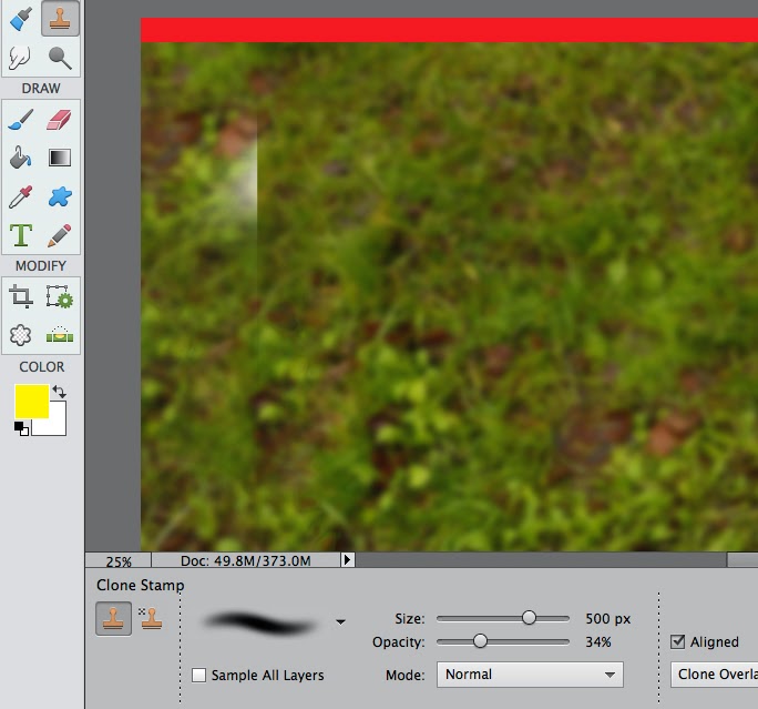
The photo I used for my double page spread had to be cropped so I used the clone tool to create a consistent background for my text. 


In my final DPS picture, I blurred the background by selecting the model and applying a Gaussian blur to the background. This makes the model appear more in focus because it look sharp and bright.

A popular convention of pop magazines is to have the pull quote in a coloured circle. I manipulated this slightly by inserting a dotted line to outline it, this makes it look classy and professional while still keeping with the young pop look.
I drew the dotted circle on a word document and copied it over to Adobe. I then used the eraser to hide the white and went around the dots individually to make sure it was all clear.

This is the text I used on the contents page. I have used slang to keep with conventions and direct address to make my audience feel involved which is what a pop magazine is all about. I used a handwriting font for the address and note from the writing editor which I felt was very effective in the existing magazines I looked at.
I learned how to shape the text into the circle to make it look professional and merge it all together rather than having block spaces where the text stops.


I learned multiple ways to cut out an image from a background. Here are two examples of ways I have cut out images. Both these images were on white backgrounds, but I did it differently to create different effects. The woman on the left is representing the fashion and lifestyle section and is positioned near the bottom to back up the text. I used an eraser with a feathered brush to make her fade into the background and give it an overall soft look. The boys were selected and zoomed in to make sure every last strand of hair was selected and then erased the background which wasn't selected.


From my previous research of existing magazines, I discovered that a lot of the double page spreads run over onto a third page or have a related section, and to illustrate this they use arrows which fit the house style. This is what I have done here using the shape tool.