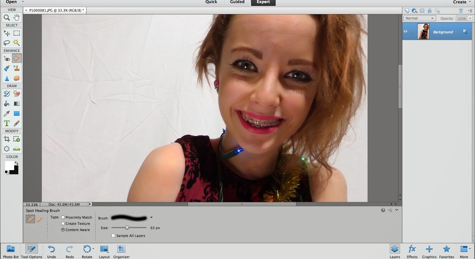
 When I first began using Adobe, I was clueless about all of the tools on there. The first tool which I could confidently use was the spot healing brush. I used this on all of my photos to make the models look flawless and professional.
I learned how to use so many of the tools which I found very useful when editing all the photos for my pages.
Another tool I found useful was to change the levels on a photo as some of them were in unflattering light which made the quality lower.

When I was able to confidently use the camera, I chose the lighting and angles carefully to get the best outcome I could. Also, by adjusting the ISO and aperture I was able to take photos in a range of different lightings.
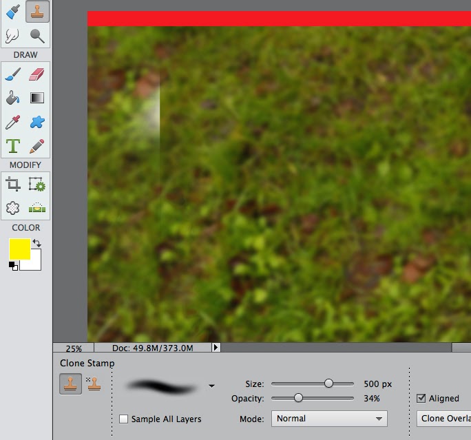 The photo I used for my double page spread had to be cropped so I used the clone tool to create a consistent background for my text.

In my final DPS picture, I blurred the background by selecting the model and applying a Gaussian blur to the background. This makes the model appear more in focus because it look sharp and bright.

A popular convention of pop magazines is to have the pull quote in a coloured circle. I manipulated this slightly by inserting a dotted line to outline it, this makes it look classy and professional while still keeping with the young pop look.
I drew the dotted circle on a word document and copied it over to Adobe. I then used the eraser to hide the white and went around the dots individually to make sure it was all clear.

This is the text I used on the contents page. I have used slang to keep with conventions and direct address to make my audience feel involved which is what a pop magazine is all about. I used a handwriting font for the address and note from the writing editor which I felt was very effective in the existing magazines I looked at.
I learned how to shape the text into the circle to make it look professional and merge it all together rather than having block spaces where the text stops.

I learned multiple ways to cut out an image from a background. Here are two examples of ways I have cut out images. Both these images were on white backgrounds, but I did it differently to create different effects. The woman on the left is representing the fashion and lifestyle section and is positioned near the bottom to back up the text. I used an eraser with a feathered brush to make her fade into the background and give it an overall soft look. The boys were selected and zoomed in to make sure every last strand of hair was selected and then erased the background which wasn't selected.

From my previous research of existing magazines, I discovered that a lot of the double page spreads run over onto a third page or have a related section, and to illustrate this they use arrows which fit the house style. This is what I have done here using the shape tool.
You need the question number and full question here in the post title Rebecca. Also, make sure you complete the full seven question evaluation. I like your use of ICT here, keep it up!
ReplyDelete